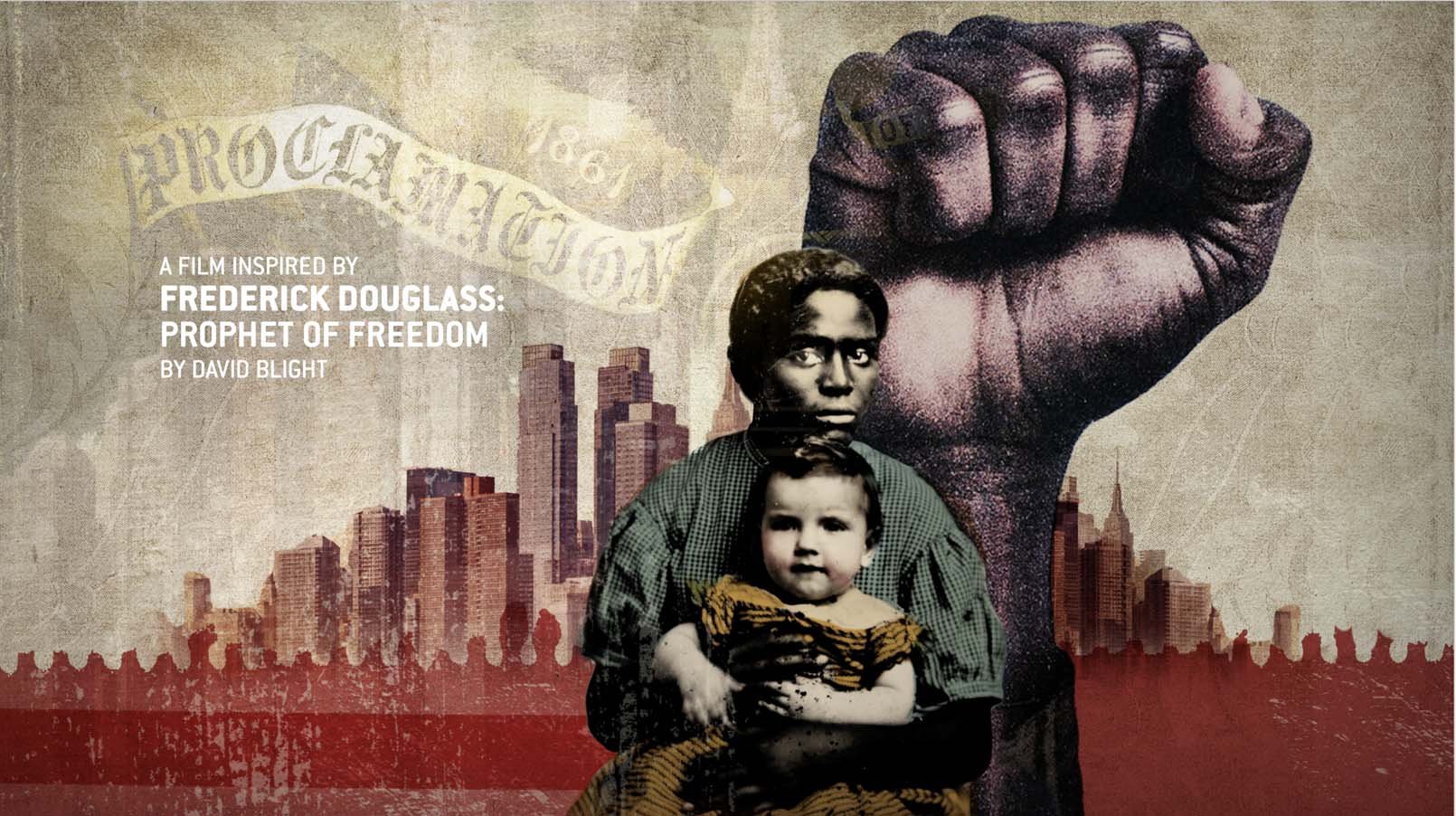
I love the American Illustration Annual. Since before Art College it was the go to book (before the internet.!) to check the highest quality work. I’ve had a few peices of illustration selected over the years but it’s been equally as cool recently to enter some motion work into the now 11th edition of their International Motion Art Awards. Griff and I entered showreels from MIND TRIP (Hulu) & FREDRICK DOUGLASS: in Five Speeches (HBO). Amazed to say both were selected. The projects will be included permanently online in The ARCHIVE motion collection and presented salon-style in November at The PARTY in New York City. I’ll pop a link in when it arrives..
MASHABLE REVIEW
How 'Judy Blume Forever' uses animation to illustrate taboo topics
Directors Davina Pardo and Leah Wolchok break down the cool animated collages in their new doc.
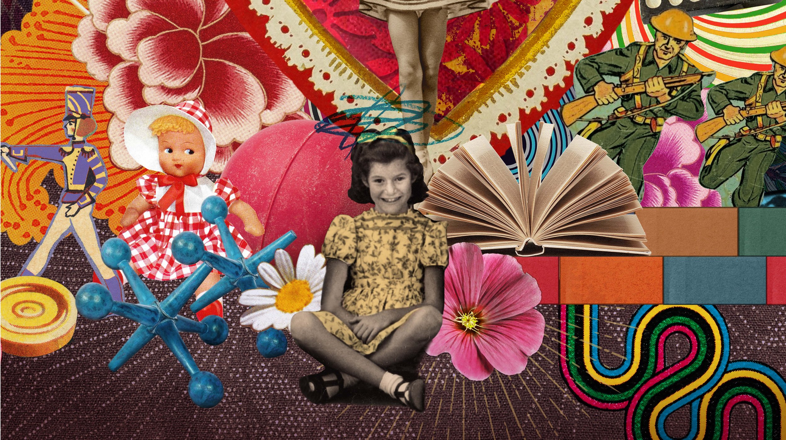
Watching Judy Blume read excerpts from her own novels aloud is one of the standout pleasures in the documentary Judy Blume Forever. And while it's delightful to hear the beloved author's interpretation of key passages from classics like Deenie, Blubber, and more, these scenes are elevated by Andrew Griffin and Martin O'Neill's fanciful animated collages.
Like Blume's work, these animated interludes are funny, playful, and especially honest when it comes to the sensitive matters of menstruation and sex. The animation depicts the former with formations of dancing tampons and pads, while literal birds and bees serve as winks at the latter.
Judy Blume Forever directors Davina Pardo and Leah Wolchok knew from the start of making the film that they wanted excerpts from Blume's work to play a large role. However, they wondered how to depict them on screen.
"Judy's writing is such an important part of the film, and establishing her voice is such an important part of the film," Pardo told Mashable in a Zoom interview. "How do we want to visualize these?"
Pardo and Wolchok discovered Griffin and O'Neill's work on Showtime's docu-series Love Fraud. Their animated collages, with their tactile and nostalgic qualities, immediately reminded Pardo and Wolchok of the pitch deck they had made when they were first developing the film.
"So we reached out to [Griffin and O'Neill] and said, 'Would you be interested?' And they said, 'You know, we're not so familiar with Judy Blume's work. We're middle-aged men living in the UK who didn't read her books, but we have daughters and it sounds fascinating. Let's give it a go!'" Pardo explained. "It was a really, really great collaboration."
Griffin and O'Neill's prior collage work already greatly aligned with what Pardo and Wolchok were looking for style-wise, but for Judy Blume Forever, they also drew inspiration from the aesthetics of original Blume book covers. Pardo and Wolchok also sent them images from the film's interviews, which took place against backdrops of vintage wallpaper, to give them a sense of the film's overall look.
As for the process of getting Blume's words animated onscreen, it all began with the incredibly difficult choice of which books to choose. Out of all of Blume's novels, which were most emblematic of Blume's life?
"We wanted the books to tell a coming-of-age story of Judy, of her characters, and of her readers," Wolchok told Mashable in a Zoom interview. "So we wanted a book about childhood, a kid on the cusp, adolescence, adulthood, and beyond."
From there, Pardo and Wolchok sent Griffin and O'Neill a list of the excerpts, as well as their thoughts about what the excerpts were about, how they fit into the movie, and what tones and themes they wanted the animation to evoke. They also provided some ideas about how to visualize Blume's work, which, given its subject matter, could sometimes prove daunting.
"[Griffin and O'Neill] were a little uncomfortable at first that we wanted to see some blood on underwear," Wolchok said. "They were like, 'Can we just make the color blue instead?' We were like, 'No, that's what they use in the commercial for pads in the '80s, when you weren't supposed to know it was blood. It was that creepy blue gel.'" However, Wolchok and Pardo noted that many of the animated sequences we see in the film were Griffin and O'Neill's ideas, as they quickly became acclimated to the source material.
What's so wonderful about the animation in Judy Blume Forever is that it evokes the essence of her work without necessarily giving us a one-to-one recreation of each excerpt. As Blume reads a bullying scene from Blubber, animation takes us not just to the school bathroom where the confrontation takes place, but to the deep ocean where orcas accost a blue whale. In the film's opening sequence, which centers on a sex education class from Deenie, the mention of masturbation sends a cheeky burst of flowers blooming across the screen.
These visual metaphors help enhance our ideas of Blume's work, but importantly, they never try to supersede out own views and memories of her novels. For Pardo and Wolchok, this aspect of the animation was always a crucial part of Judy Blume Forever.
"One of the challenges with animating the work is you don't want to be too specific, because people have a really personal connection to the books," Pardo explained. "Some people have an image of what the characters look like, and we didn't necessarily want to disrupt that image."
She continued: "We want to leave people with their own personal idea. So it was more about capturing the tone and the feel of a character and the voice of the book, rather than illustrating exactly what's happening in the scene. And [Griffin and O'Neill's] style lends itself really well to that."
WIRED ITALIA
SO COSA PENSI
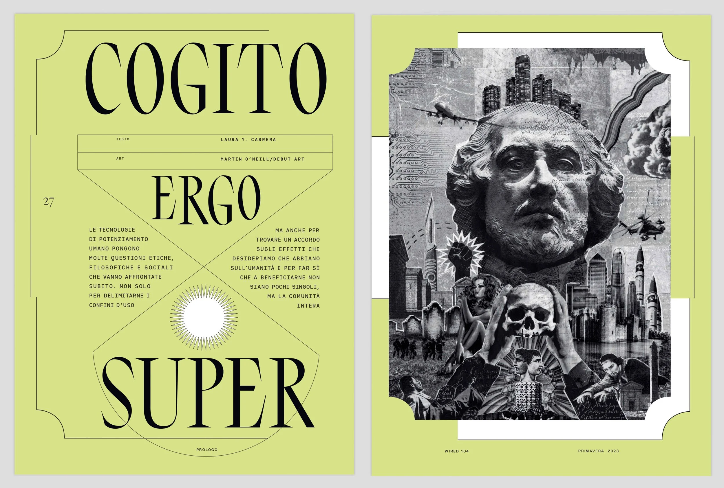
Exquisite deisgn in this months Wired Italia featuring two of my Analogue Illustrations.
JUDY BLUME TRAILER
4 MILLION HITS!
Here’s the Trailer for Judy. She’s one powerful lady. Can you spot of few of our bits in there…. more in April….
DISCIPLES OF DESIGN #UCLAN
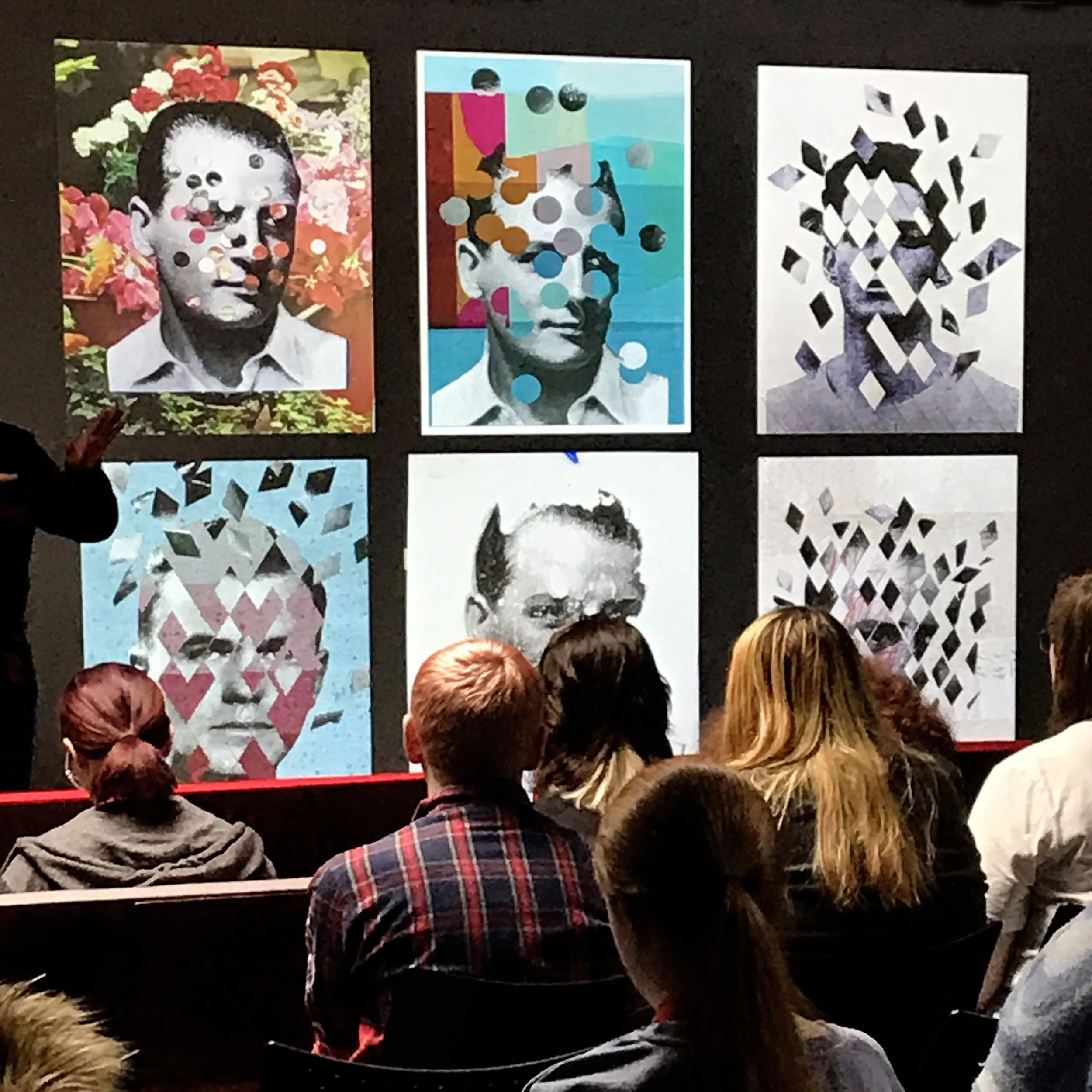
It was an honour to be one of the 20 guest speakers at ‘ Conference Week 12 ‘ @thedisciplesofdesign in Preston #UCLAN this week. University of Central Lancashire. UK
• Communication Not Just Decoration •
Lecture and Q & A with a full house of students from 1st Year Graphics to MA
from all design and Illustration diciplines.
Thanks to course director Andy Bainbridge for his Superb de-decoration video reveals for all talks.
Check > The Disciples of Design
#communicationnotdecoration #prestongraphics #conferenceweek12 #cutitoutstudio
JUDY @ SUNDANCE
JUDY BLOOM FOREVER Premiere at SUNDANCE
So excited to have our work for this documentary premiere at Sundance this weekend. Sadly we can’t share any of the animations until it’s general release on Amazon Prime Video in April.
It’s been getting sterling reviews all round.
ps. This image was not used in the documentary.
DOPE MAGAZINE
DOPE Magazine is a quarterly newspaper published by Dog Section Press.
They distribute free bundles of DOPE to anyone who could use a little solidarity, to sell on the street. Working with a network of radical bookshops, social centres, homeless organisations and independent volunteers, theycurrently distribute 30,000 copies each issue. This is worth around £90,000 to our street-vendors – or £360,000 annually.
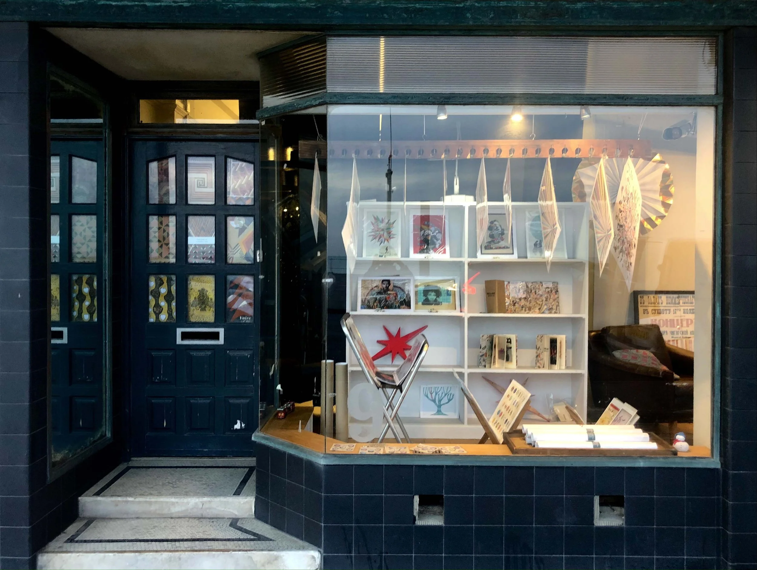
FLASH STUDIO PRINT SALE
We’ve dug deep in the planchests and located lots of vintage Cut it Out Prints, posters and artworks. opening the studio tomorrow, Friday (11-7) and Saturday (12-3) 17th December for some festive art purchasing. Contact the studio for more details.
JUDY BLUME FOREVER
I’m very excited to announce Griff and I completed a series of in show animations for the forthcoming ‘Jude Blume Forever’ documentary for Amazon Prime. Also premiering at Park City Sundance Film Festival in January 2023. We worked with directors Davina Pardo & Leah Wolchok under executive producersBrian Grazer and Ron Howard. We won’t be able to share any of the images or sequences until next spring but there’s currently more info here..
Reawakenings for Guardian Books
Always an absolute please to work with Sara Ramsbottom at The Guardian. She’s selected me wonderful briefs for a few decades now, always intriguing, unusual and has let me take the lead with the ebb and flow of ideas generation. This being a fine example. The essay, by Maggie O’Farell that this artwork is based on is here.
ONLY WHEN I DREAM
The Coningsby Gallery, Fitzrovia, London
Martin O’Neill - Ignis & Ventus
Martin O’Neill - Ventus
Gina Glover
Carol Sharp
Sam Falconer
Only When I Dream
Ignis and Ventus
In what signals something of a return to his printmaking roots with ‘Only When I Dream” Martin is exhibiting 'Ignis' and ‘Ventus', a series of works created by combining hundreds of botanical etchings, plant encyclopaedias and horticultural engravings in large scale analogue collages. The finished works conjure imagined worlds of strange conjunctions and psychedelic geographies populated with a vivid tropical flora in which a menagerie of strange and wonderful fauna coexists.
'Ignis' and ‘Ventus' is a signed and numbered limited edition of hand finished Giclee prints created from high resolution scans of original large scale analogue collages.
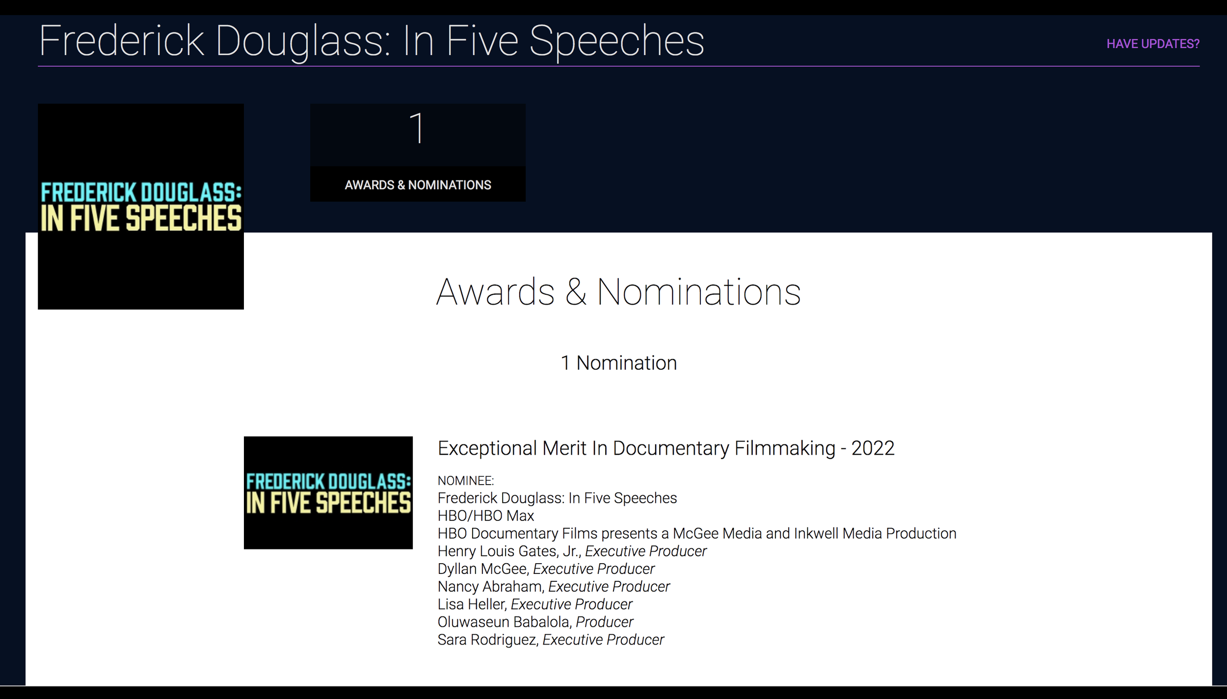
EMMY NOMINATION
ONLY WHEN I DREAM
Only When I Dream is a group exhibition curated by Beth Taubner and Andrew Coningsby. The exhibition is comprised of fine art photographs, original illustrations and one video and sound installation, all of which resonate with the exhibition topic. Artists exhibiting include renowned fine art photographers Morag Paterson, Ted Leeming, Claire Rosen, Gina Glover and multi-media artist Carol Sharp along with esteemed illustrators Sam Falconer and Martin O’Neill. Only When I Dream will stimulate the viewer as we ask them to go on a multiplicity of journeys with us.
The Celtic, poet, theologian, and philosopher John O’Donohue spoke about “the invisible world” that is constantly intertwining what we are able to know, and see. Sharing his philosophy, this exhibition is about memories and dreams, real or fabricated. Dreaming can be moments that crystallize yearnings, ethereal and romantic. They can be stories that we conjure tied to memories from the past, or the imagined past, therefore nostalgic and informed by memory or longings. We might experience highly sensory and visual waking or sleeping dreams where the mind and imagination travel to distant lands, or just next door. Our dreams might conjure untamed places in the physical world we have been to and long to experience again. O’Donohue said that a dream is a sophisticated, imaginative text full of figures and drama that we send to ourselves. These concepts are explored through the multi-dimensional language and visual landscape of Only When I Dream.
Private View: Wednesday, 31st August, 6.00pm – 9.00pm. If you plan to attend, please RSVP to andrewconingsby@coningsbygallery.com
Further information about each artist and their work can be found at https://www.leemingpaterson.com/ , https://claire-rosen.com/ , https://www.carolsharp.co.uk/ , https://www.ginaglover.com/ , https://www.samfalconer.co.uk/ and https://www.cutitout.co.uk/
OXFORD UNIVERSITY
Oxford University Museum of Natural History
I recently completed a 8 metre ( 27’) timeline collage for the 50th Anniversary Celebration of Oxford University Department of Paediatrics.
The artwork will be displayed in the department permanently later this year but is being shown at various events throughout the year. I also created a series of department specific illustrations. Explore the full length mural here.
It’s first mobile outing was at a dinner event at Oxford University Museum of Natural History earlier this week.
PAPER SCISSORS ROCK
LONDON COLLEGE OF COMMUNICATION
Thursday 9th June 2022
Hosted by BA (Hons) Illustration and Visual Media, explore the work of industry guests at LCC’s upcoming Design Show.
Join us as we welcome illustrators and designers Amber Anderson, Martin O’Neill and duo Crispin Finn in conversation with Senior Lecturer Leigh Clarke.
This event will explore the work of our speakers followed by a discussion on the ways in which traditional methods steer new methods of production and digital imaging.
We’ll also discuss how paper, pencils, pens, scalpels, scissors, and printmaking can activate campaigns and commissions.
LINK TO THE EVENTBRITE TICKETS HERE ( FREE EVENT )
SACRED HEART
KAFKA THE HYPOCHONDRIAC
Franz Kafka believed illness was at the root of his writing yet he embraced wellness fads with hearty vigour. Recent work for Aeon & Psyche Magazine. Read the full peice by Will Rees.
PROPERCHIPS
Very proud to have been invited to be a collage collaborator on this animated commercial for Proper Chips. PROPERCHIPS ‘Done Properly’ featuring Alan, the flying Cowboy. Alan guides us through the journey of the production of a lentil chip and the quest for perfect flavour combinations in a minute long extravaganza. It was so much fun working with the many artists and animators involved and of course under the superb directorship of Jack Brown..
Production: Blinkink
Director: Jack Brown
Producer: Melissa Venet, Leah Draws
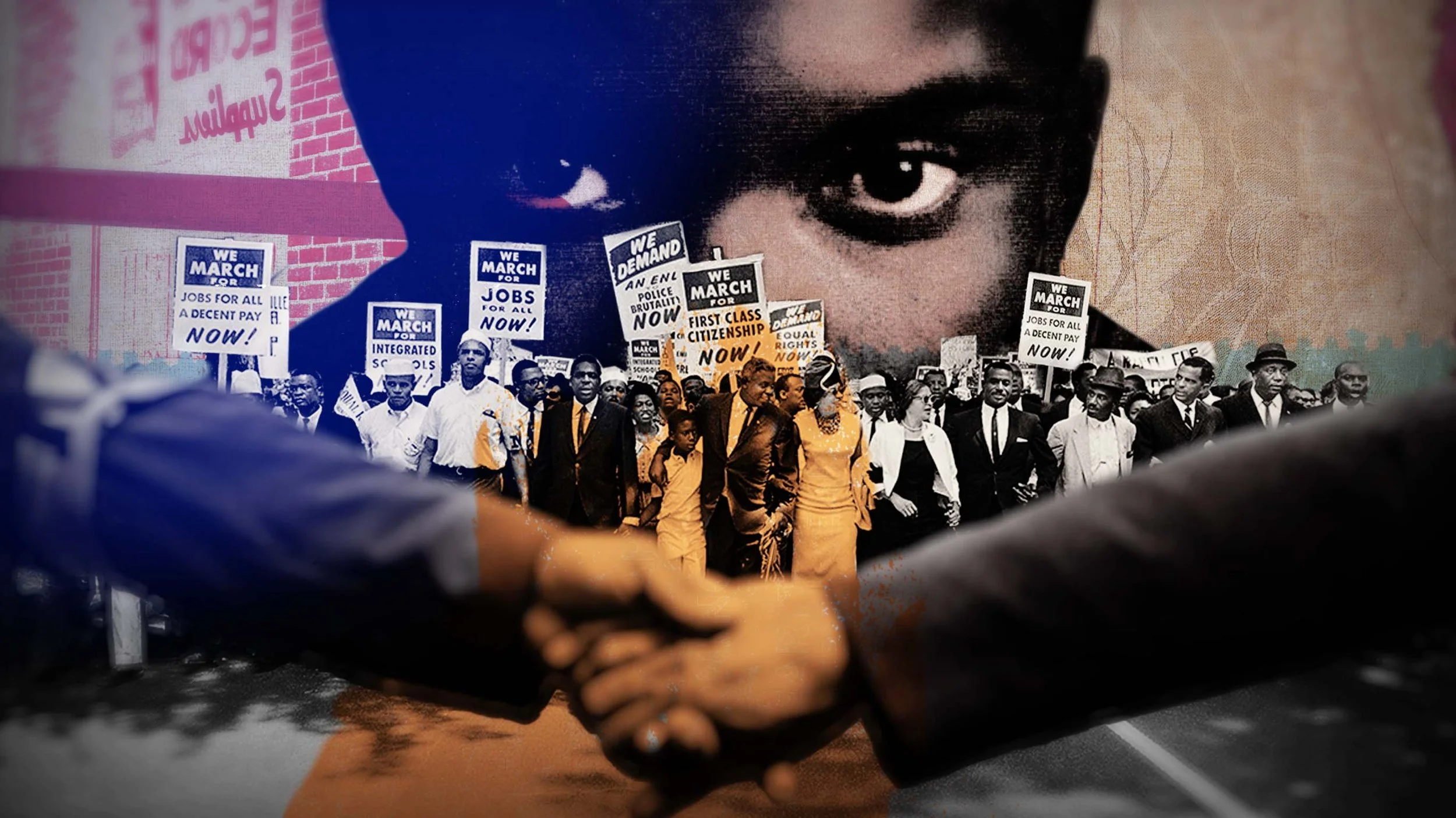
FREDRICK DOUGLASS: IN FIVE SPEECHES
FREDRICK DOUGLASS In Five Speeches
Stills from a new title sequence created with GRIFF for HBO Documentaries
FREDRICK DOUGLASS - In Five Speeches > TRAILER
In #FrederickDouglassHBO, actors Nicole Beharie, @ColmanDomingo, Andre Holland, Jonathan Majors, Denzel Whitaker, @JfreeWright remind us how the anti-slavery activist’s words about racial injustice still resonate deeply today. Premieres February 23 at 9PM on @HBOMax.
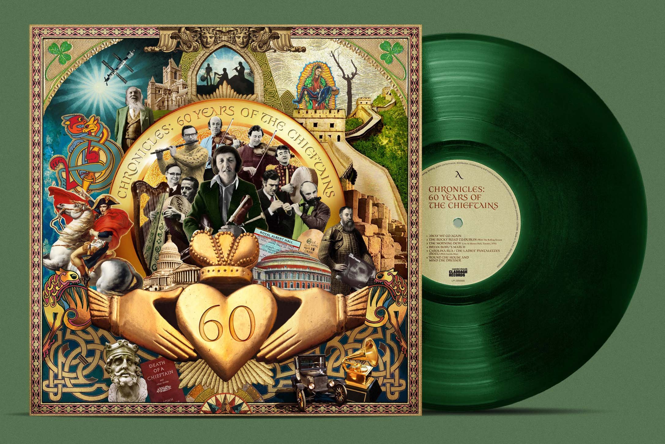
Chronicles - 60 years of The Cheiftans
It is with a sad but proud note that I share this artwork. Earlier this year I worked closely with Stan Roche & Gary Baker at Universal Ireland and Claddagh Records on this fantastic project. Chronicles 60 years of The Cheiftans’. Yes 60 - a band. It was such an insight to explore their gargantuan archive of brilliant photos, band ephemera and beautiful historical LP artworks. Paddy himself was directly involved in the artwork up until his sudden death just before it’s release. I absolutely loved the fact that he had to approve the artwork for real at home as he had no internet. The Cheiftans were firmly on the radar for me growing up in the 80s in NW London’s Irish community. My mum said- ‘sure we saw them many times in Kilburn and The Shrine and your godfather played with them..‘ It was a real honour to be a part of their rich history contributung to this fitting tribute to Paddy and the band. It’s on all formats including a plush ltd edition triple vinyl in Racing Green. Check it here at Claddagh Records. O’Neill’s March #thechieftans #thecheiftanschronicles #cutitoutstudio


